Sometimes artists and designers give themselves challenge. It’s not a good thing to practice around the same area of expertise. Sometimes it’s fine to take a leap of faith and explore different styles. There are many design styles that I haven’t tried, for example creating mascot logo. Big companies like KFC or Mr Clean have mascots on their logos and it’s really engaging to their target audience. Mascot on logos attract people, because people can relate to it. When they see a character on logo smiling at them, they trust the brand. Creating mascot logo is one of the thing I was excited to try. It’s a challenge for me, because I’m not comfortable with designing a character.
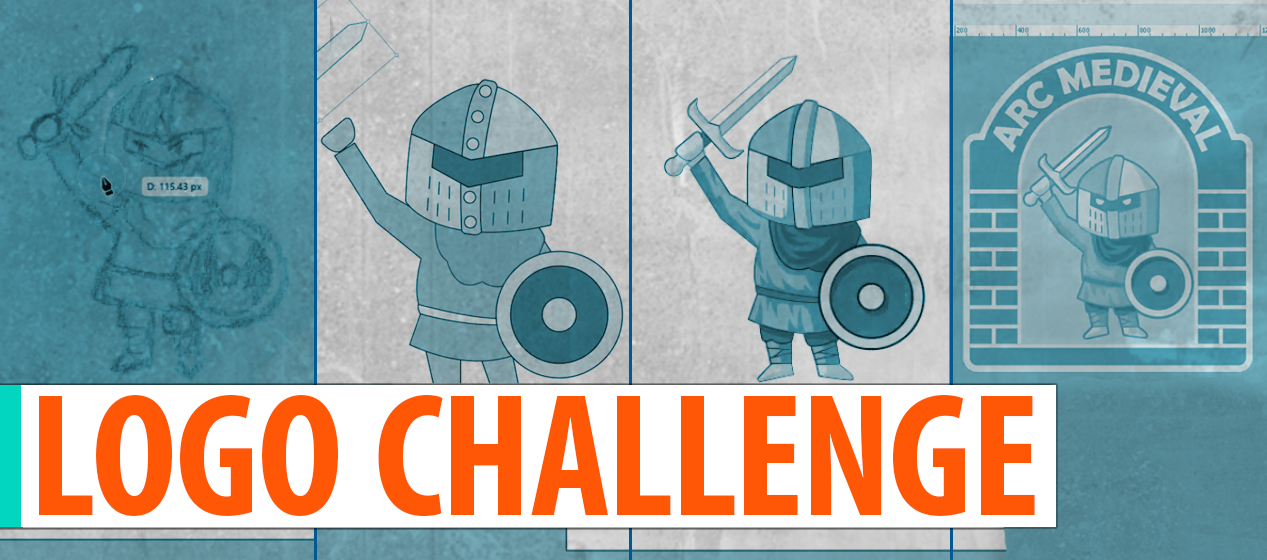
So for this design challenge I decided to create a logo and the name of the logo was chosen by a word generator. For better outcome I chose to do a two-phrased name logo. I selected the first word from 3 randomly generated words and second word from another 3 words. For the first part I got stem, arc, exhibition and survey, spy, medieval for second part. I could name my logo “Exhibition Medieval”, as of it’s a museum or something similar. But “Arc Medieval” sounded better. This logo name could be about anything, so I really wanted to go with this one.
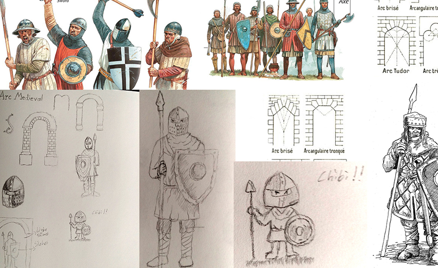
After finding the name, I searched about the medieval clothing and how many types of soldiers existed back then. I didn’t want to go cliche and create a full armored knight, but I wanted to design a normal scout soldier. To understand more about the clothing and armor I sketched many soldiers with different armor, weapons and shields. I even tried sketching a chibi version of medieval soldier which I really liked and ended up using that version. I also had to involve “Arc” in my logo to create a meaningful one. After searching about medieval architecture or more accurately “arched window/doorway” I trusted my creativity and sketched an arched gate with brick support. I was exploring which type of gate would be suitable for my logo.
Research is an important step in a design
After that I began tracing the character in Illustrator. I used pen tool to make the basic shapes and from there I started working my way to details. For shadows I mostly used pathfinder to cut perfect shapes around the traced lines. Cloth folds and how shadow forms around that was pretty tricky. I had to use many reference images, because I’m not good at drawing. The character might not look perfect, but it was fun to create something new. Something that I’m not great at however it was a practice for me. You can check the Youtube video down below. I recorded my progress on how I made the logo/emblem and through out the video I gave some tips and description.
One thought on “Design Challenge: Random Logo Design”